









If the colors of a printed fabric appear different from those displayed on a screen, it is generally not a printing error. This color difference between textile printing and screen display can be explained by several technical factors that occur between the creation of the design, its digital display, and its final printing on fabric: color space, material properties, ink absorption, and human perception are all factors to understand before starting production.
A design is created on a computer. The blue looks deep, the red vibrant, and the details sharp and precise. Then the printed fabric arrives. One question almost always comes up among customers: why isn't this color exactly the same as the one seen on the screen?
This situation is encountered by individuals as well as brand creators and textile professionals. Understanding the origin of this difference makes it possible to anticipate the result and order with confidence.

Why your screen sometimes lies without you knowing it
Every screen displays colors differently
The same digital file is never displayed identically depending on the viewing device. On an OLED smartphone screen, colors are enhanced and saturation is artificially increased. On a standard office laptop screen, color casts may appear depending on the display panel used. On a professionally calibrated screen, the result is closer to what can actually be reproduced in print.
The same file therefore creates three different perceptions before it has even been printed.
Brightness strongly influences perception
A screen set to maximum brightness almost always displays more vivid colors than those that can physically be achieved in print. Users rarely question this setting, even though it considerably distorts their perception of the final result expected on fabric.
The main culprit: color spaces

RGB and CMYK: two different worlds
The main technical reason for the difference between screen and print colors lies in the contrast between two color representation systems. A screen emits colored light according to the RGB model (red, green, blue), while printing is achieved by depositing ink according to the CMYK model (cyan, magenta, yellow, black).
| Characteristic | Screen | |
|---|---|---|
| Color model | RGB | CMYK |
| Physical principle | Emitted light | Deposited ink |
| Color range | Very wide, vivid colors | More limited gamut |
Some colors simply do not exist in print
Some colors displayed on screen fall outside the gamut, meaning they are beyond the range of colors that can physically be reproduced by a textile printer. This is particularly true of electric blue, fluorescent green, and neon pink. These colors, which appear extremely bright on screen, are necessarily reinterpreted by the color profile when converting to digital printing on fabric.
Before starting your textile printing project, create your own custom color chart and see the actual appearance of your colors on the fabric of your choice.
Create my textile color chart
Why a proof does not always look like the final fabric
A paper proof does not absorb ink like a textile
A proof printed on standard paper cannot reliably predict the appearance on a textile substrate. Paper and fabric do not react to ink in the same way, either in terms of absorption or diffusion. This is why textile printing color accuracy cannot be validated solely from a paper proof.
Fibers change the way light is reflected
Satin, cotton, and velvet do not reflect light in the same way. Satin strongly reflects light and enhances color brightness. Cotton provides a more natural and uniform appearance. Velvet, due to its raised structure, absorbs more light and deepens the colors. The same file can therefore produce three completely different perceptions depending on the chosen substrate.
What really happens inside the fibers during printing
Ink does not simply remain on the surface
Contrary to a common misconception, ink is not simply deposited onto the fabric. Three successive phenomena take place: ink penetration into the fiber, diffusion within it, and final fixation, generally achieved through heat setting or through processes specific to sublimation or direct-to-fabric inkjet printing. This journey within the material itself largely explains why the color appearance of printed fabric differs from the original digital image.
Every material reacts differently
| Material | Observed color appearance |
|---|---|
| Cotton | Natural appearance, slightly softened |
| Polyester | Very vivid appearance, ideal for sublimation |
| Velvet | Deep and intense appearance |
| Heavy canvas | More matte appearance, softened contrasts |
Why two fabrics with a similar composition can produce different results
Two fabrics labeled as 100% cotton can nevertheless produce a different visual result once printed. This situation, frequently encountered by customers, is explained by three technical factors independent of the stated composition.
The role of the weave
The density and type of weave change the way light travels between the fibers, directly influencing the perceived depth and saturation of printed colors.
The role of fabric weight
A higher fabric weight limits transparency and promotes more even ink fixation, while a lightweight fabric may reveal a slight transparency effect in the most saturated areas.
The role of surface treatments
Some fabrics receive a finish or surface treatment before manufacturing. This treatment changes the fiber's absorption capacity and can significantly alter the final appearance even when the composition is identical.
The most common mistakes observed among customers
Creating a design on an uncalibrated screen
An uncalibrated screen distorts color perception from the file creation stage, even before the file is sent to production.
Using extremely saturated colors
Highly saturated colors are the most likely to fall outside the printable gamut and be reinterpreted during the RGB-to-CMYK textile conversion.
Comparing a print under poor lighting
Artificial light, particularly lighting with a warm or cool cast, strongly changes the visual perception of an already printed color.
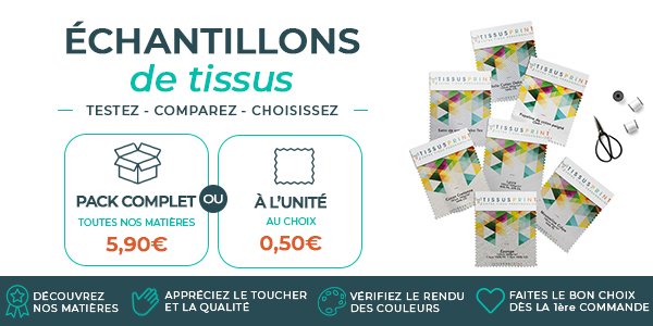
Not ordering a sample before a large production run
This step, often considered optional, is nevertheless the most reliable way to validate the final appearance before launching a large production run.
How to reduce color differences before ordering
A few best practices can significantly reduce differences between the digital preview and the final printed fabric.
- Work with high-quality files and a format suitable for digital printing.
- Avoid colors outside the gamut whenever possible.
- Request a sample before any large-volume production.
- Compare the result under natural, neutral lighting.
- Anticipate the color behavior of the chosen fabric based on its composition.
The Tissus Print experts' advice
What is observed after thousands of meters of printed fabric
Experience gained from numerous custom textile printing projects reveals recurring observations that are useful for any customer looking to anticipate their final result.
Perceived differences are often more related to the substrate than to the printing
In a large majority of cases analyzed in the workshop, the difference noticed by the customer is less the result of a printing defect than of an initial misunderstanding of how the chosen fabric reacts to color.
Satin fabrics naturally enhance saturation
An identical design printed on satin and matte cotton will consistently appear more saturated on satin, simply because of its natural shine.
Matte fabrics absorb more light
Conversely, a matte substrate slightly softens contrasts and can create the impression of a deeper color, sometimes closer to the shade actually deposited.
The most satisfied customers are those who validate a sample first
This observation is consistently confirmed: the most positive feedback comes from customers who take the time to validate a sample before placing their final order, whether for restaurant use, interior decoration, or custom textile creation.
Every fabric reacts differently to printing. With a custom color chart, compare your shades, test your designs, and choose the solution that best matches your project.
Order a custom color chart
Conclusion
A color never travels directly from the screen to the fabric. Between the two are display technologies, color profiles, inks, fibers, ambient light, and human perception itself. Understanding these mechanisms makes it possible to achieve a result much closer to expectations and avoid unpleasant surprises during textile printing.
A well-prepared project, with a suitable file and a fabric chosen with full knowledge of its properties, remains the best way to achieve accurate textile printing colors from the very first order.
Every project deserves technical guidance to anticipate differences in appearance related to the textile substrate, the colors used, and the constraints specific to digital printing. Order a printed fabric sample now to validate your result before production. For personalized guidance, ask our experts for advice. And to launch your project with confidence, get a quote for custom textile printing.
Frequently asked questions
Why is my printed fabric darker than my screen?
A screen emits light, while fabric reflects ambient light. This physical difference explains why a result may appear darker once printed, particularly on matte or heavyweight substrates.
Why does blue sometimes appear purple after printing?
Some highly saturated blues fall outside the printable gamut. When the file is converted to CMYK mode, these colors are reinterpreted by the color profile, which can shift their perceived appearance toward purple.
Can you get exactly the same colors as on a screen?
Perfect matching is technically impossible because the two substrates rely on different physical principles. However, a very close result can be achieved with a properly prepared file and an appropriate fabric choice.
Does the choice of fabric affect colors?
Yes, significantly. The composition, weave, fabric weight, and any surface treatment all affect how ink is absorbed and how light is subsequently reflected by the material.
Does a calibrated screen guarantee an identical result?
A calibrated screen significantly improves preview accuracy and reduces unpleasant surprises, but it does not eliminate the differences involved in converting from RGB to CMYK or those related to the textile material.
Why do colors appear different depending on the lighting?
Ambient light directly changes the visual perception of a color already fixed on the fabric. Warm lighting enhances red and orange tones, while cool lighting strengthens the perception of blues.
Should you always order a sample before a large production run?
This step is strongly recommended for any large order. It remains the most reliable way to validate color appearance before committing to production in large quantities.
Which fabric offers the best color accuracy?
Polyester, particularly when used for sublimation, generally provides very accurate and luminous color reproduction. However, the optimal choice depends on the intended end use, whether interior decoration, restaurant applications, or garment creation.


0 commentaires